
COT2
|
|
| | liber antiquus |  |
| | | Author | Message |
|---|
Shadowcrunch
Journeyman

Posts : 902
Join date : 2011-06-23
Age : 48
Location : Wisconsin, USA
 |  Subject: liber antiquus Subject: liber antiquus  Thu Oct 30, 2014 8:06 am Thu Oct 30, 2014 8:06 am | |
| As some of you know, my latest art project idea involves homemade paper in bulk quantities. The final paper product must be larger than 5x7, and able to take ink without too much bleed around and/or through. Some of you have seen my first attempts, done without using a blender to create my pulp, but instead using a paint mixer drill attachment. It worked, but there were too many big chunks for a real paper 'feel'. In fact, I basically made lumpy cardboard. Perhaps next time I should ask around if anybody has an extra blender... oh, wait...  Vader helped me make the paper, and 2 of 3 pieces came out decent enough. The one that sucked became a test for taking ink, and it works. Using a dip fountain pen with drawing nib, I made a half-ass artistic cross thing on one of the better sheets, and the cross gave me a story idea which lead to the need for script. Lacking a calligraphy tip, I decided to take the story parts tied to the cross image and google translate them into latin (and back to English so I knew how bad it all really was). I used a Pilot disposable fountain pen to write in very small cursive, the ink running just enough to make most of the text officially unreadable, but the finished product looked okay. Then Vader mentioned how the cross was too something... was it the uniformity of line thickness? Don't remember. Anyway, it didn't look 'ye olde' enough. I replied that I was hoping for style like medieval illuminated manuscripts, which we both google imaged, and wow... I simply didn't have enough. Last night, just for shits and giggles, I decided to try editing and adding to my page. I did a quick pencil sketch with no plan, inked it, and started adding color. The worst part was trying to cover some of my script with water colors, and the two numbers in big boxes turned out like crap...like they used to make the first letter of a page take up half the page, but I didn't have the room and I was just testing the concept anyway. I then went over my colors with semi-transparent colored glitter pens, since I've seen some illuminations done in metallic inks or paints or whatever. Here is a before and after... (both clickable for bigger images I believe) 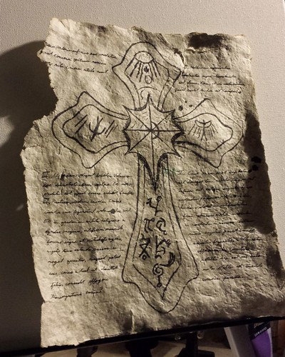 Ye Olde experiment Ye Olde experiment by shadowcrunch, on Flickr 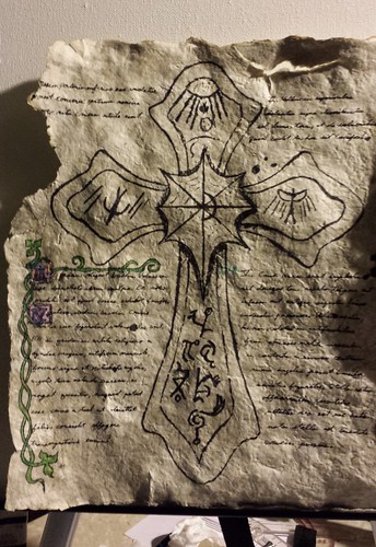 Ye Olde experiment Ye Olde experiment by shadowcrunch, on Flickr What did I learn? The thick paper from this first batch can take ink in multiple layers without bleed. It can also handle watercolors and acrylics. Covering real ink with either type of paint sucks ass. Even a tiny bit of "illumination" can take a blah page and make it SHAZAAM! I understand why 'we' stopped doing the illumination thing with single color printing presses and time constraints and all that, but in this day and age of digital art and print, why the hell haven't we gone back to this?! I now know how I want to proceed with my official project, assuming my next batch of paper turns out better... | |
|   | | Shadowcrunch
Journeyman

Posts : 902
Join date : 2011-06-23
Age : 48
Location : Wisconsin, USA
 |  Subject: Re: liber antiquus Subject: Re: liber antiquus  Wed Nov 12, 2014 10:43 pm Wed Nov 12, 2014 10:43 pm | |
| Wow...practice and read and learn! Looks like they were right about the more I know about one to grow on. So I have been trying different techniques, both from web pages and from my own observations. Oh, right now I'm still talking about paper making itself. No new pictures, because screw you, the reader! My next attempt after the first three pieces of cardboard Vader helped with... I tried to make thinner paper, and basically made tissue. Yes, you could actually see shapes through it when held up to a light source. That's awesome, but of course ink and paint bleeds through BAD. Further experimentation has lead me to a few pieces of damn fine 'thick card stock', which I haven't tried writing on yet, but they are thin enough to fold in half or roll without cracking! After hitting a few more websites, I have some ideas which I will be trying soon to increase production, uniformity, and drying time! Now on to the stuff you might enjoy learning also... SO... also trying to learn more about the concept of medieval illumination as pictured in the previous post. Guess what! That wasn't illumination! That was colorful scribbles on paper... illustration, if you will. Turns out the medievals called their art style illumination because of the massive amounts of gold leaf applied during the process. Illumination because the gold leaf was burnished (rubbed???) and sometimes shaped so when light caught the page, it would appear to glow. That, friends, is fucking awesome. Want to know more? Check out this nicely explained website: EDIT: Before you click, I should add this guy makes his own parchment, so if you might find a big pot of boiling animals skins nauseating, skip the first pic or two! http://www.randyasplund.com/pages/article/schiff1.html OH! This gentleman even goes so far as to explain the making of his own dyes and paints in the 'old ways', which is also damn interesting, and there's a link at the bottom for page 2. This guy is a paper hero...just saying. NOW... if I can ever make enough paper to attempt binding the shit into a small journal or something, how the hell would I do that?! Vader and I discussed and did a little research and found some sites with good tutorials on making hardcover bindings from scratch... and we were right that many use cloth! YAY, us! Shit...nevermind. I was going to say I found a site that shows the 'old ways' for making a hardcover binding, but it's page 2 of the above link! Also pretty frickin amazing! Looks like tons of fun, but I'm soooo not set up for melting metal and wax casting. If you're not either, perhaps a more contemporary solution? http://www.instructables.com/id/How-to-bind-your-own-Hardback-Book/Lastly, for now... Many of these medieval works of art have tons of color, as I linked to in the previous post. I assumed they were colored inks of the time period, but I'm learning much of it was dyes and pigments. That's cool because I was trying to make watercolors that would flow properly from a dip pen. Drawing nib for imagery, nice wide nib for calligraphic script. Oooh, pretty! It hasn't been working. I did some digging and found that many artistic types recommend adding some gum arabic to watercolors. Well shit, another something to purchase for a project involving recycling paper?! And though the walmart website has a nice selection of gum arabic, does our local walmart?   Digdigdig... or it sounds like PVA glue would be a decent, more cost effective alternative. PVA glue? Where the fuck do we find that?! Oh... poly vinyl acrylate... one of the main ingredients in Elmer's. Whew! So there's something to keep in the back of your head! Apparently a little Elmer's, mixed with already mixed watercolors, will give your "ink" a bit more grab on a nib, slowing the flow to normal ink rates, AND will give a slight shine to the dried paint! I will let you know how that goes when I get that far... unless I can find some cheap gum arabic... or an acacia tree I can tap for sap... Shit. Lastly part deuce. I made a big deal about the cloth for book covers above because that was another thing I got schooled on. So we know 'old ways' types used plants, skins, and wood pulp to make paper. We also know it's possible to make paper using wood pulp, AND using plants in the same way as I'm doing the recycling thing. Yes, you can take grass or leaves or flowers and blend them up into a pulp, and strain it into sheets! BUT, there have been times and cultures in history that paper was made from rags and scraps of cloth! Guess what! Contemporary instructions use the same technique I'm using now! Blend into a pulp, strain into sheets. YES! Cut old clothes up, and make pages out of them! How awesome is that?! Okay. Dunbar. For now. | |
|   | | Shadowcrunch
Journeyman

Posts : 902
Join date : 2011-06-23
Age : 48
Location : Wisconsin, USA
 |  Subject: Re: liber antiquus Subject: Re: liber antiquus  Sun Nov 16, 2014 1:47 am Sun Nov 16, 2014 1:47 am | |
| | |
|   | | Shadowcrunch
Journeyman

Posts : 902
Join date : 2011-06-23
Age : 48
Location : Wisconsin, USA
 |  Subject: Re: liber antiquus Subject: Re: liber antiquus  Sun Nov 16, 2014 1:51 pm Sun Nov 16, 2014 1:51 pm | |
| Returned to the project this afternoon to find the foil sun shape was not sticking. The cross is fine. I used the same glue and same technique, and in fact didn't try polishing the sun yet so it would have time to set, but I found it bubbling in the center and peeling at the edges. With a lack of gold or silver or copper leaf in this one horse town, I went with plan F. A little metallic chrome-like spray on a coffee can lid, applied with a brush. As it dried on the lid and the juice evaporated I was left with a sticky pile of metal flake, which I applied thickly to the crown area. The sun shape has the thinner silver on the smooth dried glue surface, the crown has a crunchy silver flake directly on the paper texture. See the difference? Don't know about normal paint or leaf, but this technique catches the light almost better than the polished foil! Dare I say, my page is illuminated? Does anyone know enough about chrome type sprays to know if I might be able to rub a shine into this without removing the paint? While there, I dove into my next base color, and finished my session with a nice picture that I found out after upload is annoyingly blurry. Sorry folks! OH! Also notice how nice and vibrant that ultramarine blue dried! SWEET!!!  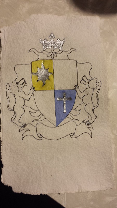 Coat of Arms Experiment Part 6 Coat of Arms Experiment Part 6 by shadowcrunch, on Flickr" /> | |
|   | | Shadowcrunch
Journeyman

Posts : 902
Join date : 2011-06-23
Age : 48
Location : Wisconsin, USA
 |  Subject: Re: liber antiquus Subject: Re: liber antiquus  Tue Nov 18, 2014 6:58 am Tue Nov 18, 2014 6:58 am | |
| | |
|   | | Shadowcrunch
Journeyman

Posts : 902
Join date : 2011-06-23
Age : 48
Location : Wisconsin, USA
 |  Subject: Re: liber antiquus Subject: Re: liber antiquus  Wed Nov 19, 2014 1:24 am Wed Nov 19, 2014 1:24 am | |
|  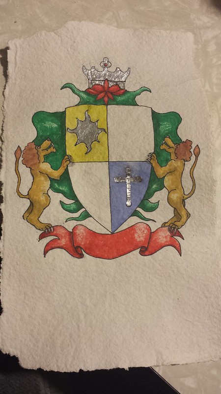 Coat of Arms Experiment Part 8 Coat of Arms Experiment Part 8 by shadowcrunch, on Flickr" /> Now that I'm this far, my art shortcomings really shine. The green backdrop is supposed to be some kind of cloth. Having not paid close enough attention to proper cloth shading, it looks like poorly lit jello. Oh well, It's just a test of techniques and the threshold of my paper anyway. Tomorrow, hopefully, I will trying brush calligraphy scripting. Maybe that won't suck.  The real issue with the nasty green jello cloth is it's supposed to be some of the archaic swirly shit. Example stolen from a nice person's blog:  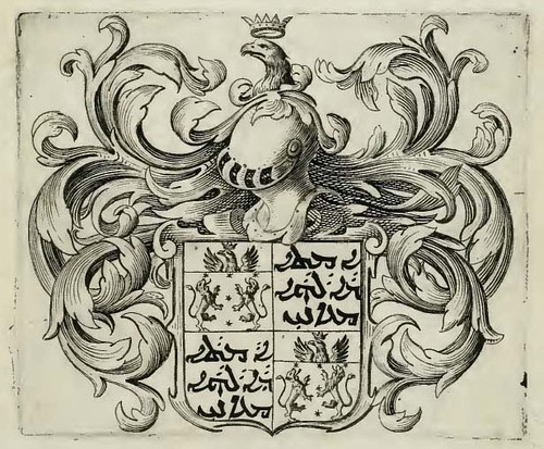 maani-coat-of-arms-copy maani-coat-of-arms-copy by shadowcrunch, on Flickr" /> Problem there is I had a shield shape and a ribbon/banner across the bottom and a whole big mess of blank paper around it. I had plans for lions or dragons or some damn thing on both sides of the shield (did you know there are also birds, deer, bears, and manticores???). So my brain says "ooh that archaic swirly shit like we saw on google images!" My inner voice says "yeah, you know... like the stuff on our American money!" My mind's eye sees archaic swirly shit with dollar bill more-than-necessary cross-hatching. My hand says "Huh? Are you fuckin nuts?!" and suddenly I have jello. I should have just done a backdrop of swords or spears or arrows or mink pelts. Sigh... next time! | |
|   | | Shadowcrunch
Journeyman

Posts : 902
Join date : 2011-06-23
Age : 48
Location : Wisconsin, USA
 |  Subject: Re: liber antiquus Subject: Re: liber antiquus  Thu Nov 20, 2014 4:32 pm Thu Nov 20, 2014 4:32 pm | |
| So I had a minor confrontation with the Sandman last night, who won, of course... so I didn't get back to the project. I have a possible foil/leaf experiment to test out (more on that in a minute). I also have to get cracking at the brushed calligraphy concept, and I found another something neat. One of the many forums I've been checking for different techniques, a nice artist person mentioned having printouts and examples of ye olde writing styles. There was even a link to a site where you can BUY copies of actual manuscripts from the age of yore. I don't remember the details, but they were pricey. Today, I accidentally find: http://medievalwriting.50megs.com/scripts/scrindex.htmScrolle downe ande clicke thee variouse linkse at your leisure, and the pages that follow show samples of that script. You can then hover over the picture to get a little box showing you the...not the translation, but the words with modern letters so you can differentiate between a C and a G and all that. Nice site with awesome historical (and artistic) significance! Here is one of my favorites so far: http://medievalwriting.50megs.com/scripts/examples/imperial1.htm Yeah, try writing like that all day! Hope you find it as interesting as I! Now, the foil/leaf. Since this damn town is seriously lacking in art supplies, and I don't have the necessary acacia trees for a decent glue, I was trying to figure out some way to make my fake gold/silver leaf in a more realistic fashion. So Vader mentions that a lot of candies come in very thin foil inside the paper packaging! So I buy a bag of Hershey's Kisses and we have been making the sacrifice of eating them for art, taking extra pains to try flattening the foils without ripping them. I have a small collection, and that will be my next attempt at leafing! Kudos to Vader!!!... if it works!  | |
|   | | soothsayer
Journeyman

Posts : 1516
Join date : 2011-06-30
Age : 52
Location : Right here.
 |  Subject: Re: liber antiquus Subject: Re: liber antiquus  Fri Nov 21, 2014 10:13 am Fri Nov 21, 2014 10:13 am | |
| Just for the record, I do have a calligraphy set. And a book on calligraphy styles throughout history. Should you ever want to make use of them. | |
|   | | Sponsored content
 |  Subject: Re: liber antiquus Subject: Re: liber antiquus  | |
| |
|   | | | | liber antiquus |  |
|
| | Permissions in this forum: | You cannot reply to topics in this forum
| |
| |
| |
|
